The Mighty Voices
A digital community that empowers people facing health challenges and disabilities through the sharing of real-life health stories.
ROLE & DURATION
Concepting, UX/UI, Prototyping & Testing
Team of 2 designers, 1 product manager and 5+ developers
March – September 2018
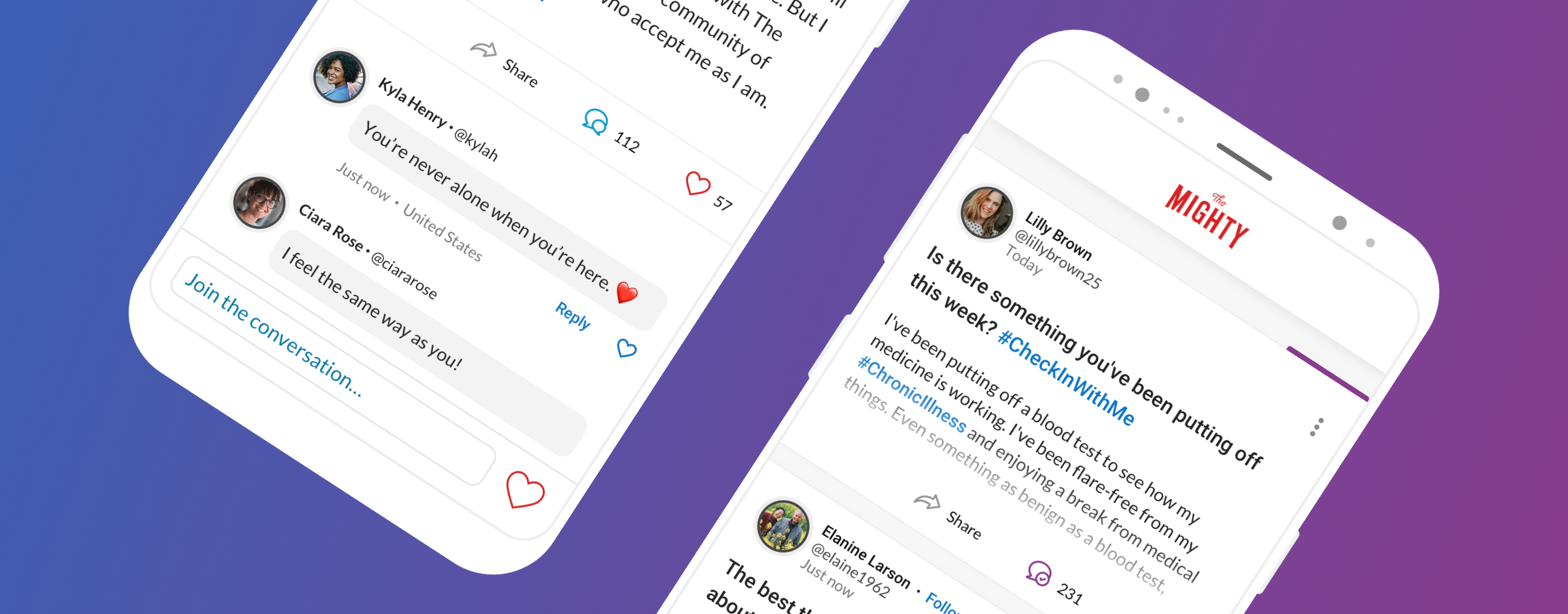
The Beginning: A Growing Platform
The Mighty were founded in 2014 by CEO Mike Porath and since then, the platform has become a digital health advocate for over 2 million users. As the platform evolved, The Mighty grew more passionate about featuring voices with a diverse range of expertise and experiences. So, our contributor platform was born. With autonomy to ideate topics and publish stories, our contributor content attracted 30 million visitors one year after launch.
As our platform’s community of health warriors and health-curious grew, it became clear that our users desired even more ways to share, connect, and support each other. This realization gave way to a new feature of The Mighty – The Mighty Voices.
The Problem: The Need for Connection
Nearly half of the U.S. population has at least one chronic medical condition. About 48 million have disabilities and almost 17% suffer from a mental illness.
This reality has been the driving force behind The Mighty Voices’ mission. While the contributor network is a major focus of our platform and will continue to thrive through the sharing of long form content, we understood the intrinsic need for our members to feel heard and understood in real-time. To feel empowered to express thoughts and feelings in the moment and receive instant reactions and support. It was our job to give them the power to express themselves in this way.
User Research: Uncovering The Needs
More than ever before, user-centric functionality and targeted communications are major for publishing platforms. Those best practices are even more crucial when it comes to a wellness platform. That being said, our team was very diligent about discovering and learning our audience. Using conducted research, user personas, and contributor surveys, they narrowed our user needs into three major categories.
 MARCO
MARCO
Long-time patient, concerned about privacy
Seeks out support when isolated
 NATE
NATE
Newly diagnosed and navigating the shift in lifestyle
Desires to better understand complex and unfamiliar health topics
 ELLEN
ELLEN
Caregiver who is playing her own role of a loved one
Desires to share her story and support others in her same position
Define the MVP: Scoping the Challenges
When The Mighty Voices team got to work, our goal was to create a minimum viable product. We decided that Voices would only be available to Mighty members, but contributor stories will still be published publicly in order to leverage broader reach of audiences. The MVP goals were as follows:
• Cultivate a community of support, empowerment, and belonging for users
• Encourage the sharing of a diverse range of thoughts, feelings, and knowledge
• Give users control of when and what they expressed
• Allow users the ability to react and respond to content in real-time
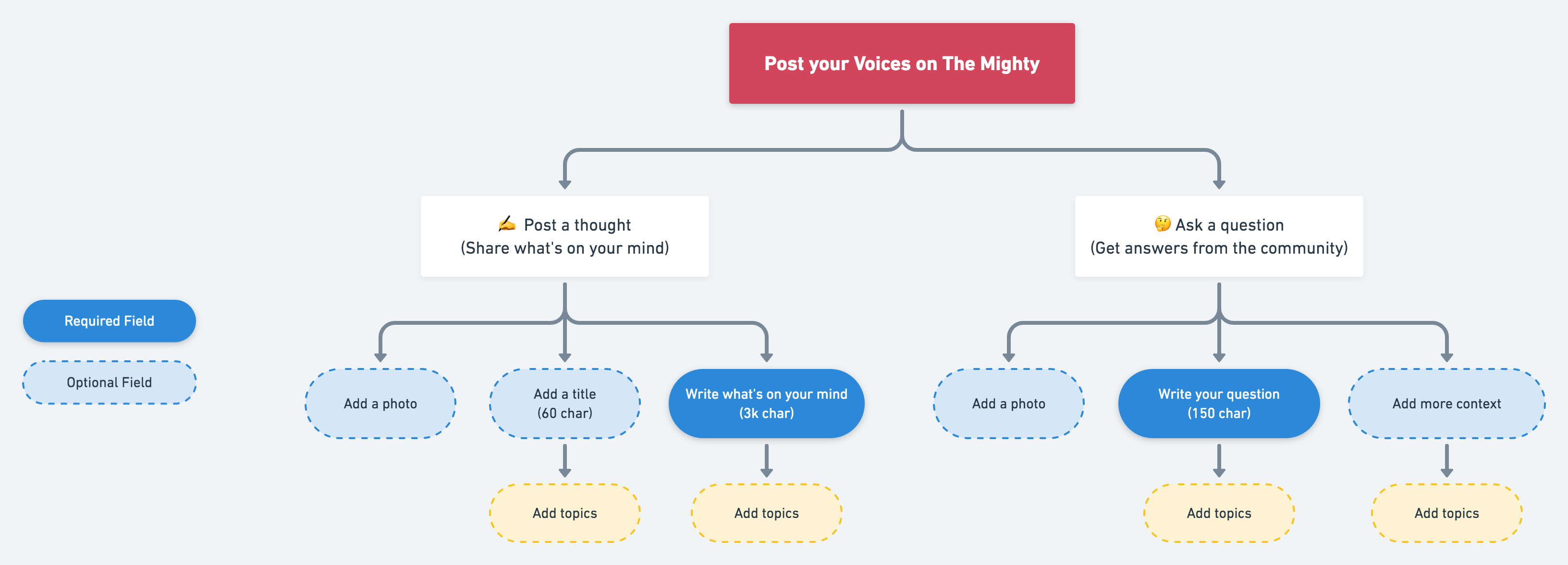
Post Creation Flow
Design Process: Iterate. Test. Repeat.
After the initial insights were gathered from the research and stakeholders, it was my turn to bring our brainchild to life through design. When it comes to UX design, context is everything. I began by creating wireframes and user flows that spanned a variety of user scenarios. Once created and approval of the product manager was secured, we conducted usability tests with the low-fidelity mockups.
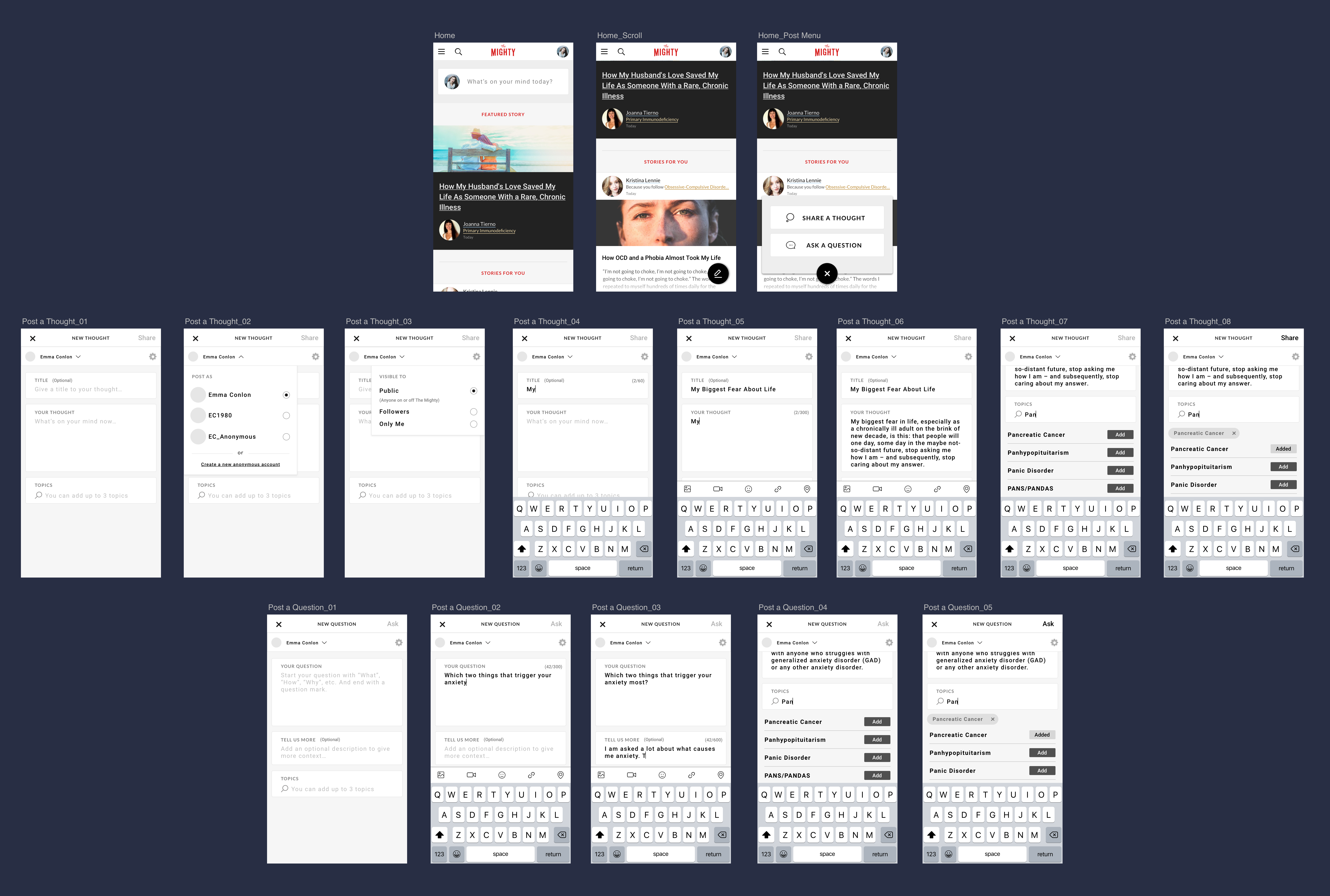
Early Stage of Voices Concept
I believe that UX design is only as good as the pain points identified and resolved during user testing. Luckily for me, I had a team of excited and willing teammates to help identify the biggest pain points during the conceptualizing phase by way of the paper prototype. During the iteration, testing was conducted at every milestone and InVision prototypes were shared with stakeholders to keep the feedback loop flowing strong.
After numerous tests and QA, the Alpha Voices project was launched among our staff and contributors in June 2018 with a final release to the public in July.
Problem Solved: Design Solutions
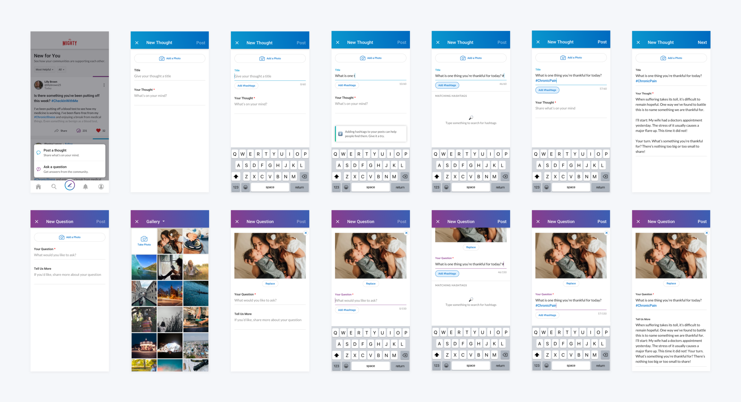
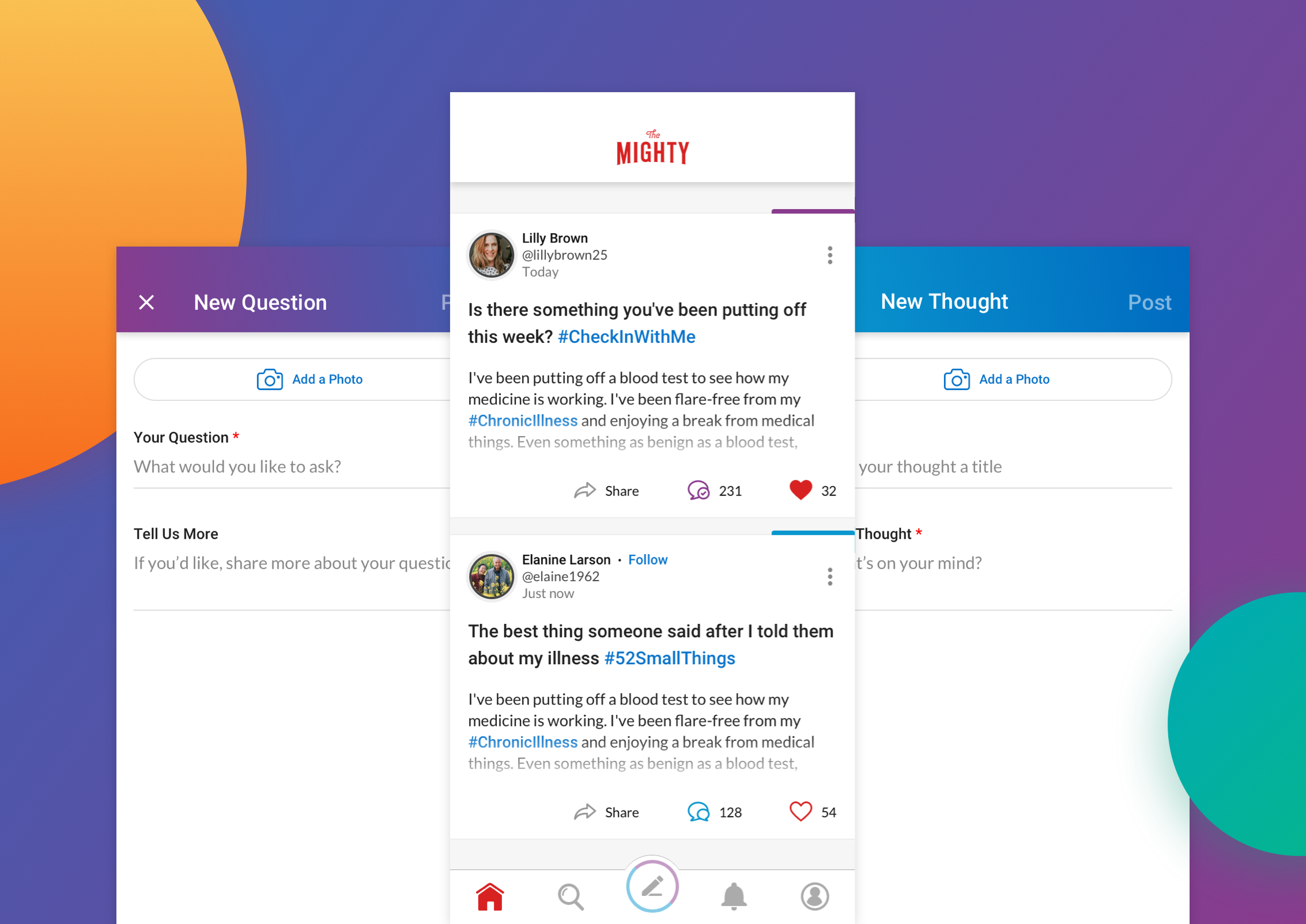
Empowering Users to Express in Real-Time
The Mighty members can now post their thoughts, feelings, and questions to an inner-circle of millions who care, support, and understand what they’re going through. It makes me proud that a feature so simple offers users such significant value.
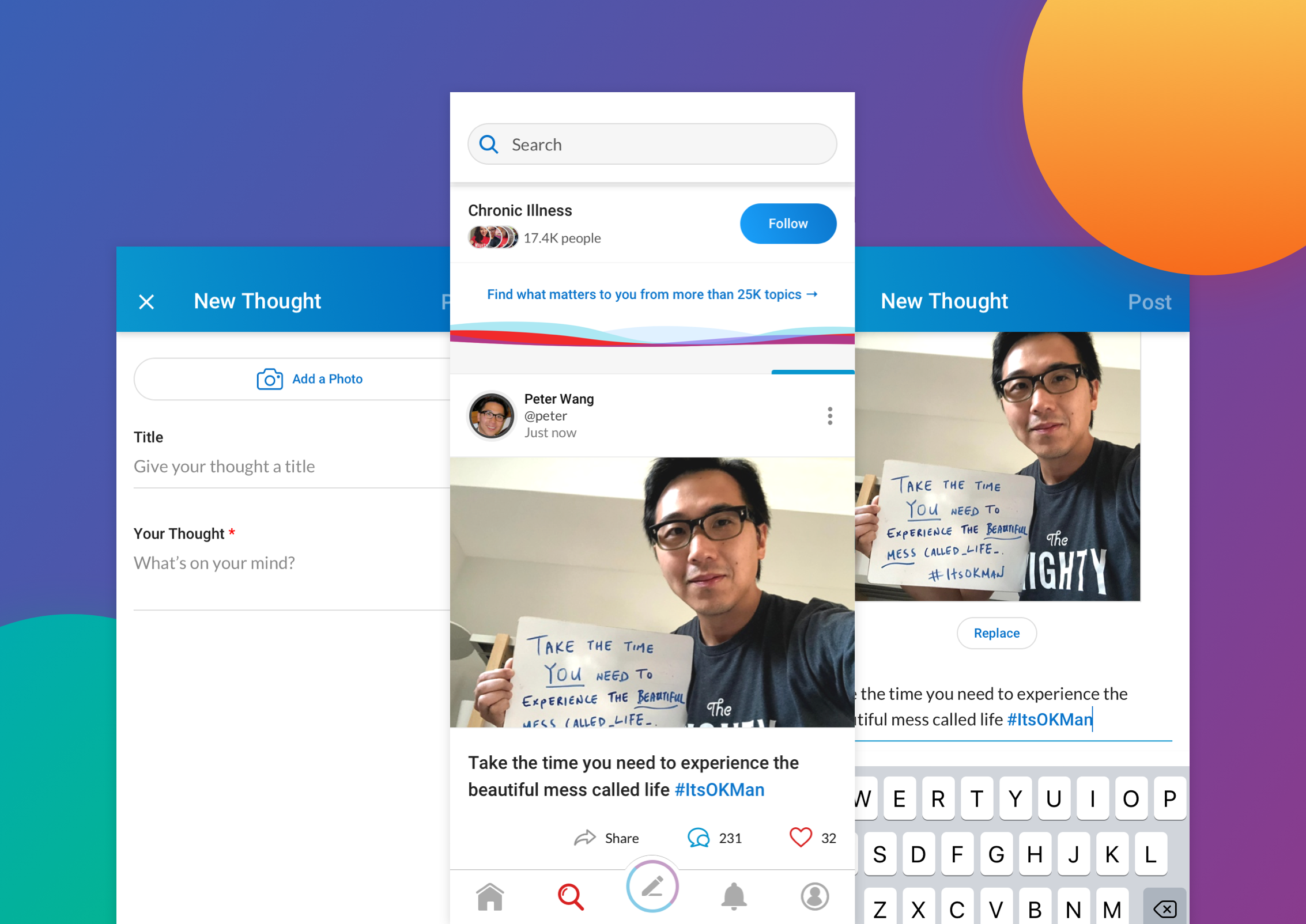
Express with Photos When Words Aren’t Enough
Sometimes, words alone don’t tell the entire story. Whether you prefer reading, visualizing, or both, our photo and content features accommodate users with an alternate style of expression.
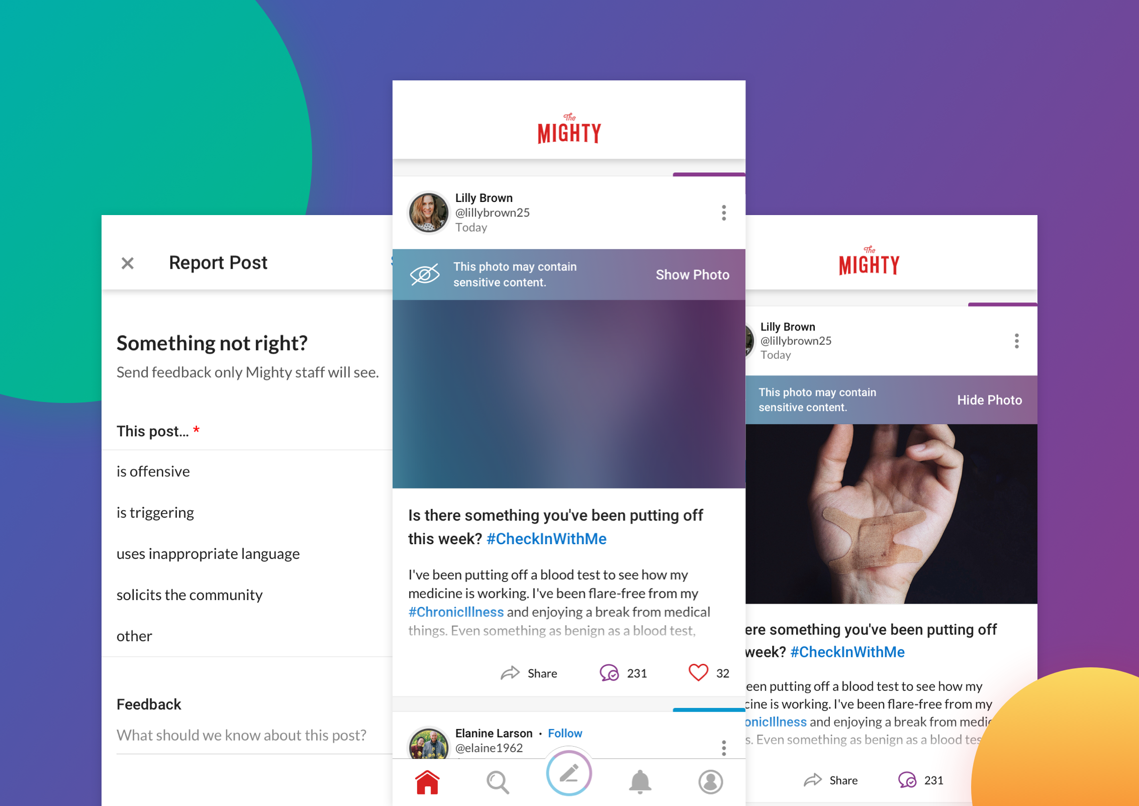
Cultivate Safer Experiences Through Sensitivity Warnings
When inspiring a health community of 2 million users, it’s important to ensure everyone feels safe while consuming the content. I was especially mindful that posts told through imagery had the potential of being triggering or sensitive to certain users. Whenever sensitive imagery is shared, a sensitive message will notify users and give them the control to show and hide the photo if desired.
Seeing the Impact: Measuring the Success
When the Voices feature launched, the platform fundamentally changed from a content hub to an engaged community. New users would go from one-time content consumers to Mighties for life after encountering the positive and empowering community that thrived within. These qualitative wins were also mirrored in quantitative metrics. Since Voices launched:
• Engagement rate has more than doubled
• Membership has increased to 2.8 Million+ users
• Voices content outperformed contributor stories
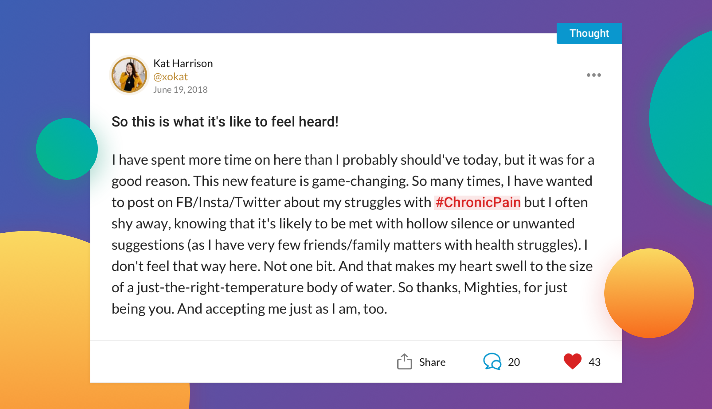
The most rewarding part was what our Mighty users had to say:
Design Takeaway: Accessibility Fuels Inclusivity
Through this project, I learned that boosting a product’s accessibility enhances the user experience for all parties involved. Because of the unique nature of our community, we needed an inclusive design to account for users with visual, cognitive, and mobility limitations. That being said, the app required the implementation of sufficient color contrast, making sure the VoiceOver feature worked seamlessly and eliminating distracting micro-interactions. This project has taught me to be mindful of how design can be a catalyst to such inclusivity.
